Case Study 06
Noir Estates
Extraordinary homes. Exceptional living.
Luxury Real Estate Website
Visit Live Website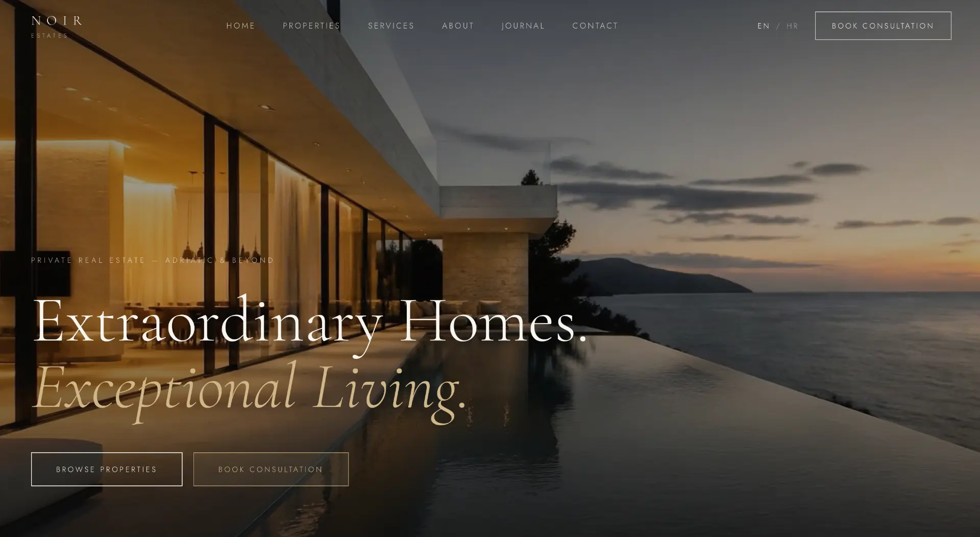
Project overview
Noir Estates is a private advisory concept for luxury real estate on the Adriatic and beyond. Properties are presented as a curated collection, not a listings database. The site sells the life a property enables — space, light and view — and the consultation is a discreet next step.
- Properties as a collection, not a classifieds board.
- Photography of space and light as the primary carrier of the message.
- A discreet consultation for buyers who value privacy.
The challenge
Luxury real estate online usually looks like classified ads: compressed photography, specification tables and aggressive contact forms. The brand is indistinguishable from aggregators, and a buyer investing millions sees no reason for trust. The challenge was to build a digital space that matches the value of what it sells.
Goals
Present properties as a story about life, not a table of square metres.
Build a collection feel — fewer properties, more attention.
A consultation discreet and always available, without pressure.
International buyers: English as an equal primary language.
Discovery & strategy
Analysing the behaviour of luxury property buyers shows they do not compare square metres — they compare lives. The decision is emotional and slow, and discretion is a condition. The strategy therefore built a gallery experience: few exhibits, plenty of space, zero noise.
Buyers purchase a life, not square footage — photography and context carry the decision.
Restraint signals exclusivity: fewer properties with more attention convert better than a catalogue.
High-profile buyers value discretion — contact must be an invitation to talk, not a lead form.
WEBINITY Framework
Every WEBINITY Original is built through the same five-phase framework. The framework is constant; the execution is always unique.
Business, users, market and the real questions clients ask.
Strategy, message, information architecture and success metrics.
Typography, scale, photography, rhythm and the design system.
Clean execution, performance, accessibility and SEO foundations.
Launch, measurement, iteration and long-term support.
UX process
Journey mapping
We defined the steps of the user journey and the single question each step must resolve.
Information architecture
Content is ordered by the sequence of questions, not by the company's internal structure.
Wireframe
Structure was tested without photography so hierarchy holds up without emotional support.
Prototype
The mobile prototype was walked through a real scenario: evening, one hand, weak signal.
Design system
The system is deliberately small. Fewer variables mean a more consistent impression on every page and simpler maintenance.
High fidelity design
Cinematic full-width property photography, interrupted by quiet passages of text. Serif headlines and gold accents build the tone of a private gallery, not an agency.
Behind the decisions
Information hierarchy
Space and light come before price and square metres, because emotion starts the conversation and numbers justify it.
Navigation
Six items: properties, services, about, journal, contact. No filters, no listings chaos.
Consultation flow
Booking a consultation is a discreet, constant invitation — phrased as a conversation, not a sign-up.
Photography
Cinematic golden-hour frames. Every property gets the space it deserves.
Typography
A large serif for emotion, a discreet sans for specifications. A hierarchy that breathes.
Spacing
Extremely generous spacing — luxury is never crammed.
Accessibility
Contrast above AA despite the dark palette, and semantic structure throughout.
Responsive behaviour
On mobile, photography fills the entire screen — a property must stay cinematic on a small display.
Premium perception
Exclusivity through limitation: a curated collection, not an exhaustive catalogue.
Final result
The result is a site that works like a private screening: dark, calm and assured. The buyer does not browse listings — they experience properties, and the consultation arrives as the natural continuation of a conversation.
Lessons learned
In luxury, less is more: a curated collection outsells a catalogue.
High-profile buyers do not fill in forms — they accept invitations to talk.
Full-width photography is the only way a screen can convey space.