Case Study 01
Arena
A venue you feel before you ever visit it.
Luxury Wedding Hall Website
Project overview
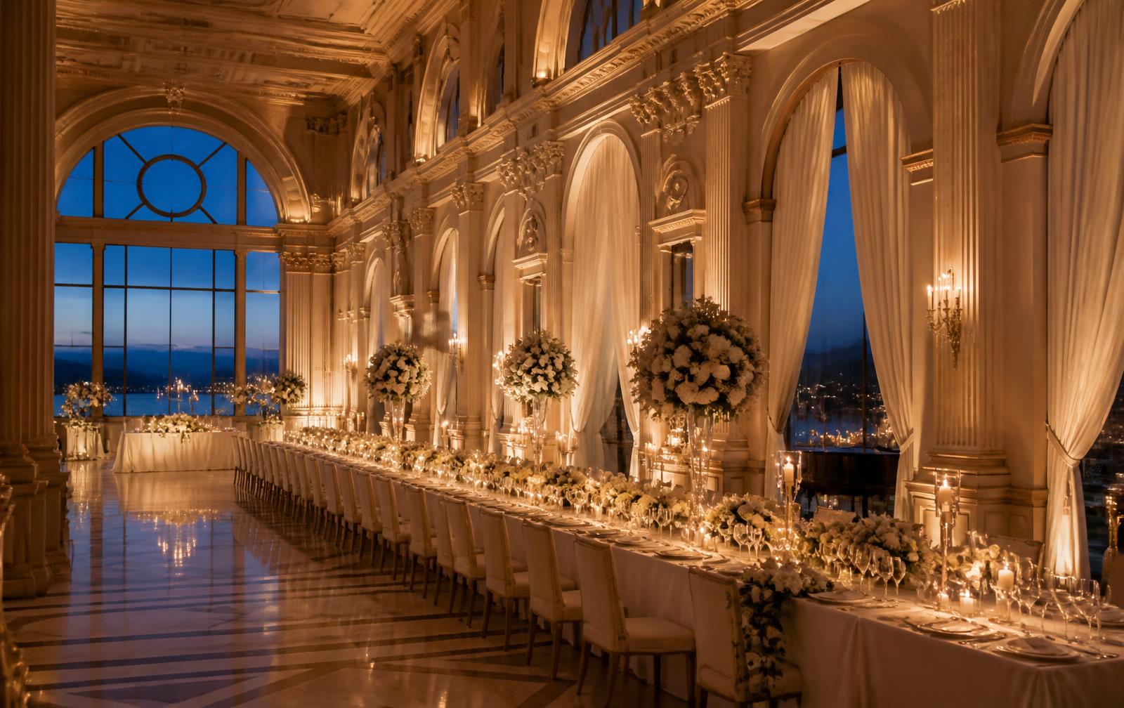
Arena is a wedding hall whose greatest asset — its atmosphere — was completely invisible online. The goal was never a prettier website, but translating the feeling of the space into the exact moment a couple makes an emotional decision about their venue.
- One site that replaces the conversation before the conversation.
- Photography as the primary carrier of the message.
- The enquiry as a natural next step, never as pressure.
The challenge
Couples compare five to ten venues at once, mostly on mobile and mostly in the evening. The previous presence was a photo album without context: no capacity, no flow of the evening, no pricing, no clear path to an enquiry. Decisions were made on price rather than experience.
Goals
Convey the atmosphere of the hall within the first five seconds.
Answer three key questions: capacity, availability, impression.
Increase qualified enquiries, not clicks.
Deliver a flawless mobile experience on weak connections.
Discovery & strategy
Before design, we analysed real enquiries, conversations with couples and regional competitors. Couples were not looking for more information — they were looking for certainty. The strategy became reductive: less content, a clearer promise, stronger photography.
The decision is made emotionally and justified rationally — the site must support both moments.
Capacity and availability block everything else. They have to be visible immediately.
Trust grows through specifics: numbers, rooms, names, real photography.
WEBINITY Framework
Every WEBINITY Original is built through the same five-phase framework. The framework is constant; the execution is always unique.
Business, users, market and the real questions clients ask.
Strategy, message, information architecture and success metrics.
Typography, scale, photography, rhythm and the design system.
Clean execution, performance, accessibility and SEO foundations.
Launch, measurement, iteration and long-term support.
UX process
Journey mapping
From inspiration to venue visit we defined five steps and the single question each step must resolve.
Information architecture
Content is ordered by the sequence of questions, not by the company's internal structure.
Wireframe
Structure was tested without photography so hierarchy holds up without emotional support.
Prototype
The mobile prototype was walked through a real scenario: evening, one hand, weak signal.
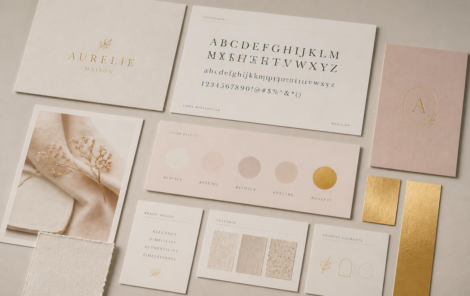
Design system
The system is deliberately small. Fewer variables mean a more consistent impression on every page and simpler maintenance.
High fidelity design
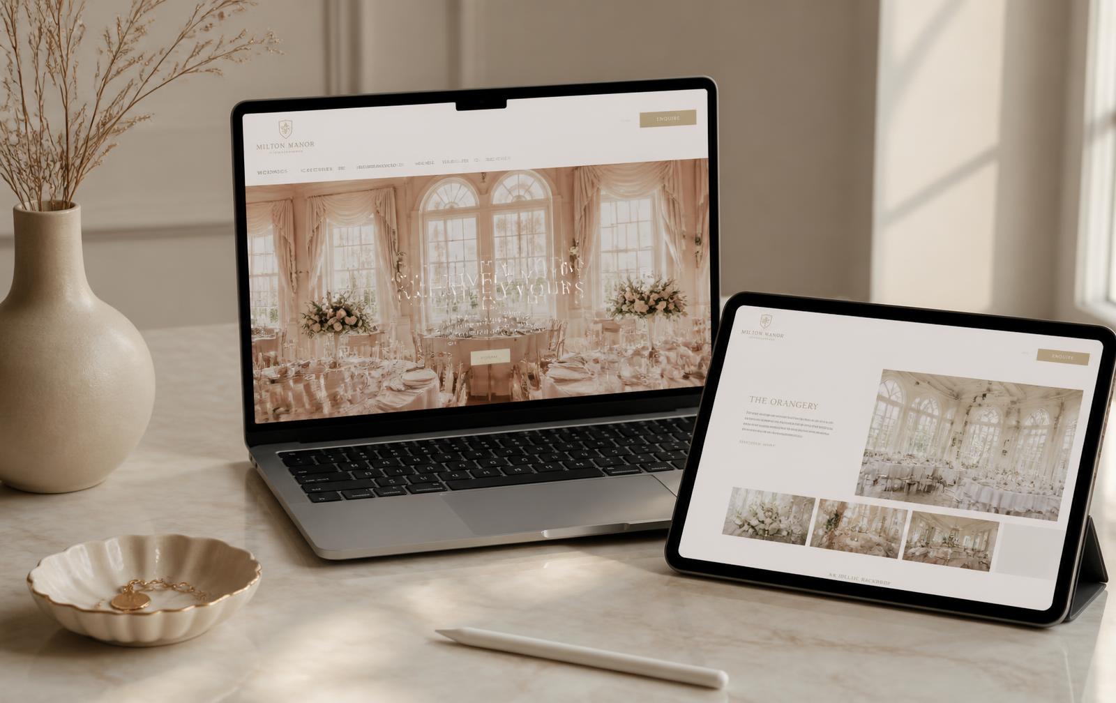
The final design builds rhythm: wide photographic moments followed by quiet textual pauses. The space between sections matters as much as the content itself.
Behind the decisions
Information hierarchy
Capacity and atmosphere come before company history, because that is every couple's first question.
Navigation
Five items, no dropdowns. Every extra choice slows the decision down.
Booking flow
The enquiry is a short form with three required fields. Date is optional because most couples have no fixed date yet.
Photography
No stock imagery. Only the real space in real light, because authenticity is the only proof.
Typography
Serif carries emotion, sans carries information. Splitting the roles prevents decorative noise.
Spacing
Generous space signals confidence. Dense layouts subconsciously read as cheaper.
Accessibility
Contrast above AA, visible focus states, semantic headings and alt text on every photograph.
Responsive behaviour
The mobile layout is not a shrunken desktop — section order changes to match mobile intent.
Premium perception
Luxury comes from restraint: fewer elements, slower motion, better photography.
Final result
The result behaves like a first conversation: clear, calm and convincing. Enquiries arrive better prepared, with capacity understood and expectations realistic.
Lessons learned
When the product is a space, photography is strategy — not decoration.
Shortening the form improved enquiry quality more than any design change.
Slower motion reads as confidence; fast motion reads as nervousness.
Next project
Smile Dental
Premium Dental Clinic Website
Currently crafting the next WEBINITY Original.