Case Study 05
Lumière Dental Studio
A healthy smile, designed with precision.
Dental Studio Website
Visit Live Website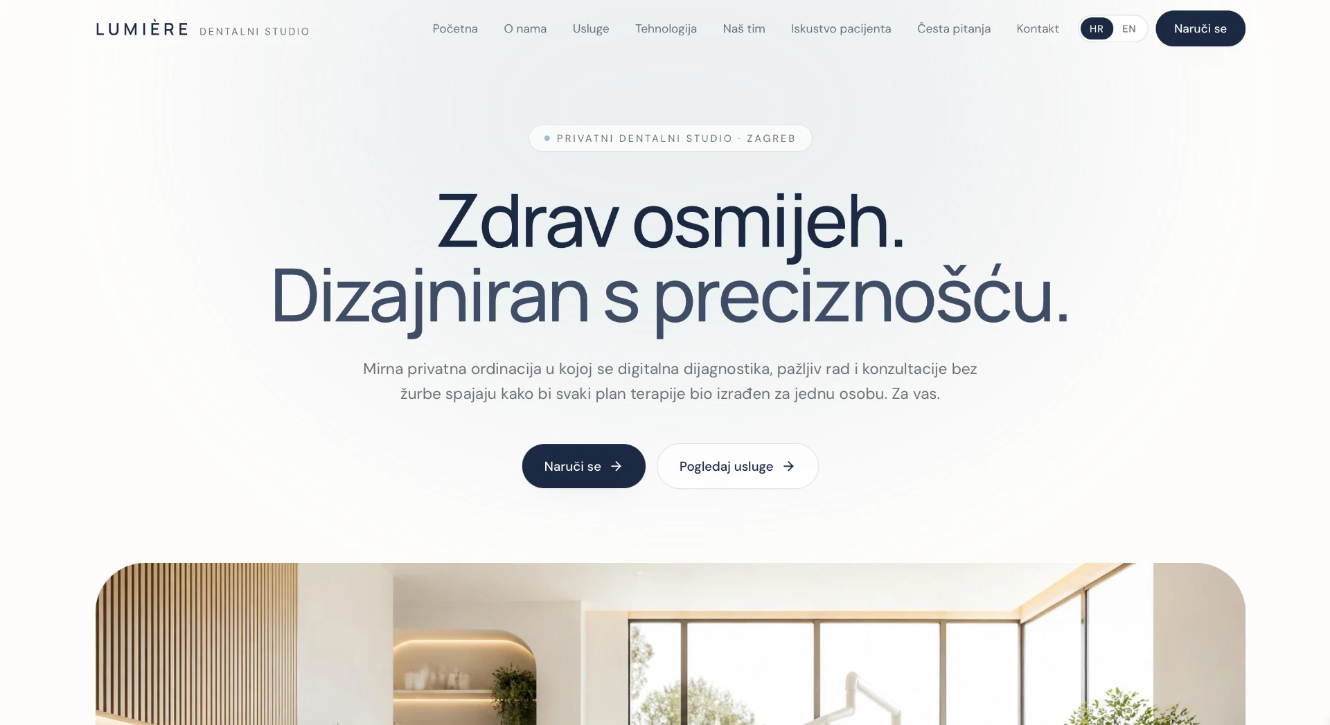
Project overview
Lumière is a private dental studio in Zagreb combining digital diagnostics with careful, unhurried work. The site must reduce anxiety before the first visit — and explain technology through reassurance, not jargon. A calm, confidence-building experience for a studio built on long-term relationships.
- A first impression that soothes, not frightens.
- Technology explained in the language of patient benefit.
- Booking without a phone call, in a few steps.
The challenge
Fear of the dentist is one of the most common reasons for postponing a visit — and most clinic websites only amplify it: clinical coldness, stock photography of smiles and walls of services. The challenge was to design an experience that guides the patient step by step, at a pace that does not hurry.
Goals
Reduce anxiety on the very first screen — through warmth, not clinical precision.
Explain services and technology in plain language.
Online booking without a mandatory phone call.
Patient experience and FAQs in a visible place.
Discovery & strategy
Conversations with patients of private practices show that the choice of studio comes down to a feeling of safety: will someone listen to me, explain things and not rush. The strategy therefore placed the patient experience ahead of the service list.
Patients choose the feeling of safety — technology matters only as proof of care.
FAQs reduce anxiety more than any marketing copy.
A soft, light palette lowers tension — clinical white reads as coldness.
WEBINITY Framework
Every WEBINITY Original is built through the same five-phase framework. The framework is constant; the execution is always unique.
Business, users, market and the real questions clients ask.
Strategy, message, information architecture and success metrics.
Typography, scale, photography, rhythm and the design system.
Clean execution, performance, accessibility and SEO foundations.
Launch, measurement, iteration and long-term support.
UX process
Journey mapping
We defined the steps of the user journey and the single question each step must resolve.
Information architecture
Content is ordered by the sequence of questions, not by the company's internal structure.
Wireframe
Structure was tested without photography so hierarchy holds up without emotional support.
Prototype
The mobile prototype was walked through a real scenario: evening, one hand, weak signal.
Design system
The system is deliberately small. Fewer variables mean a more consistent impression on every page and simpler maintenance.
High fidelity design
A light, warm palette with soft radii and plenty of air. The photography shows the real studio — wood, light, plants — because the patient must recognise the place before entering it.
Behind the decisions
Information hierarchy
Safety and patient experience come before the service list, because anxiety blocks everything else.
Navigation
Seven items, from services to FAQs. Language a patient understands without a dictionary.
Booking flow
Online booking in a few steps, with a clear expectation of what happens after the enquiry.
Photography
The real space and the real team — no stock smiles. Authenticity is the only cure for anxiety.
Typography
A soft, readable sans with generous line height — nothing may look like a medical document.
Colour
A light base with warm wood tones; deep navy for trust, never sterile white.
Accessibility
Contrast above AA, large booking buttons and content readable for older users.
Responsive behaviour
On mobile, booking follows the user — most patients open the site from their phone.
Premium perception
Premium in healthcare means care: more space, fewer elements, not a single aggressive pop-up.
Final result
The result is a site that works like a first conversation in the studio: calm, warm and clear. The patient arrives prepared, with less fear and with realistic expectations of the first visit.
Lessons learned
In healthcare, design first treats anxiety, and only then informs.
FAQs are the strongest content on the site — because they answer fears, not wishes.
Technology sells only when translated into patient benefit.