Project overview
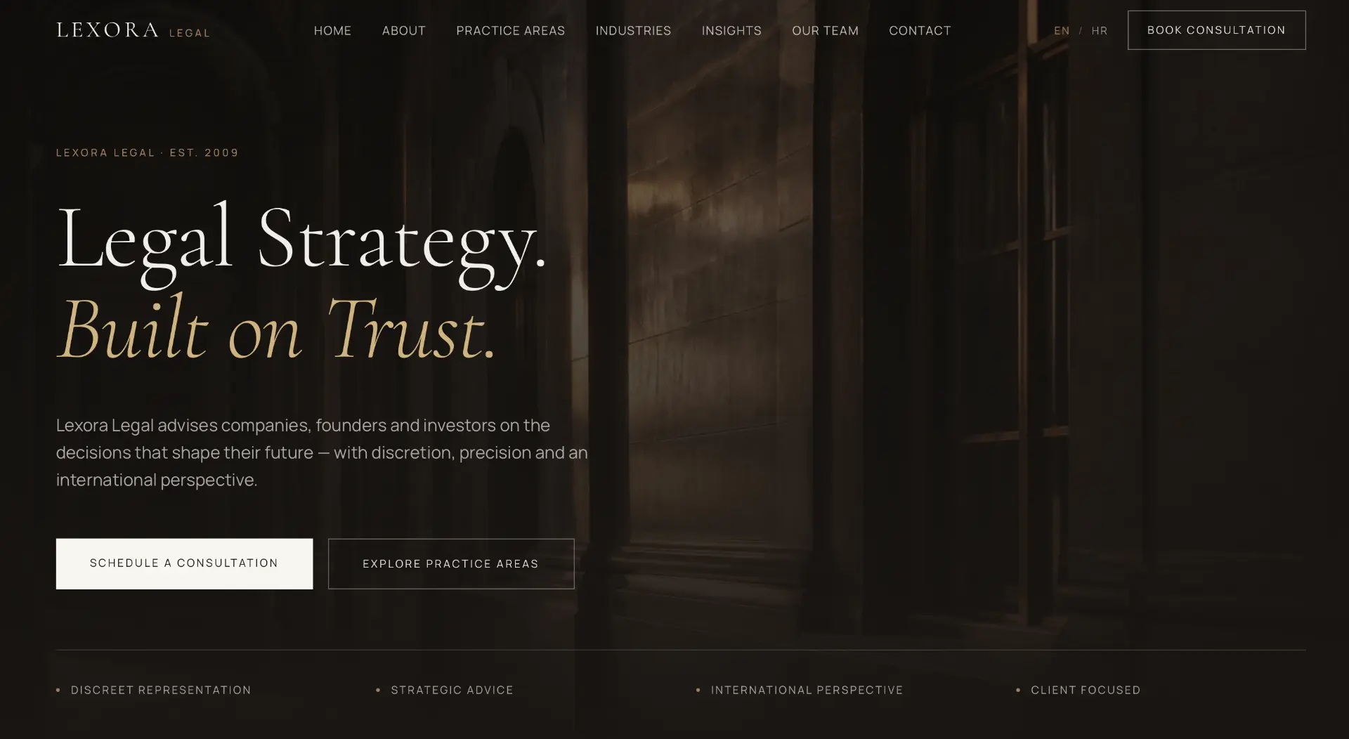
Lexora Legal is a boutique law firm advising companies, founders and investors. The site must communicate what is hardest to see in law: discretion, precision and an international perspective. Authority — without the coldness legal communication usually carries.
- Practice areas structured around client questions, not internal departments.
- Booking a consultation as the primary, always-visible step.
- A tone that builds trust before the first meeting.
The challenge
Law firm websites usually pick one of two extremes: intimidating formality that alienates, or generic corporate design that says nothing. Expertise stays invisible behind jargon, and a potential client cannot tell whether the firm is right for their problem. The decision then falls to word of mouth — and the site plays no part in it.
Goals
Communicate discretion and precision through the design itself, not only the copy.
Practice areas readable in under a minute.
A consultation one step away, from any page.
An international perspective visible already in the navigation (EN/HR).
Discovery & strategy
Analysing how clients choose legal counsel shows that clients buy certainty: they want to know their problem is understood and in safe hands. The strategy therefore built clarity as the primary signal of competence.
Clients choose certainty — clarity of language reads as clarity of thought.
In law, restrained design is experienced as discretion, not as a lack of content.
Founders and investors compare firms across several tabs — the first impression decides who gets the call.
WEBINITY Framework
Every WEBINITY Original is built through the same five-phase framework. The framework is constant; the execution is always unique.
Business, users, market and the real questions clients ask.
Strategy, message, information architecture and success metrics.
Typography, scale, photography, rhythm and the design system.
Clean execution, performance, accessibility and SEO foundations.
Launch, measurement, iteration and long-term support.
UX process
Journey mapping
We defined the steps of the user journey and the single question each step must resolve.
Information architecture
Content is ordered by the sequence of questions, not by the company's internal structure.
Wireframe
Structure was tested without photography so hierarchy holds up without emotional support.
Prototype
The mobile prototype was walked through a real scenario: evening, one hand, weak signal.
Design system
The system is deliberately small. Fewer variables mean a more consistent impression on every page and simpler maintenance.
High fidelity design
Dark, architectural photography and a calm typographic hierarchy build authority without aggression. The gold accent is used sparingly — only where attention needs direction.
Behind the decisions
Information hierarchy
Practice areas and consultation come before the firm's history, because the client is first looking for an answer to their problem.
Navigation
Seven items with complete clarity: from practice to team to contact. No legal jargon in the menu.
Consultation flow
Booking a consultation is a constant, discreet call to action — visible, but never aggressive.
Photography
Architectural, dark photography that communicates seriousness and space — no stock handshakes.
Typography
A classical serif for authority, a precise sans for information. A combination that echoes legal tradition.
Language
Every sentence passes one test: would a client understand it without a legal education?
Accessibility
Contrast above AA, comfortable readability of long texts and a clear heading structure.
Responsive behaviour
On mobile, the consultation becomes a sticky element because contact decisions happen on the move.
Premium perception
Discretion as luxury: fewer colours, fewer elements, more room for content to breathe.
Final result
The result is a site that works like a first meeting: serious, warm and precise. The client arrives at the consultation with clear expectations — and with trust the site has already built.
Lessons learned
In law, clarity is the strongest proof of competence — stronger than any reference.
Authority does not require coldness; it requires precision.
The best legal website is the one after which the client knows what to ask in the first meeting.
Next project
Lumière Dental Studio
Dental Studio Website