Case Study 03
Aurea
Escape into serenity — before you ever arrive.
Resort & Spa Website
Visit Live Website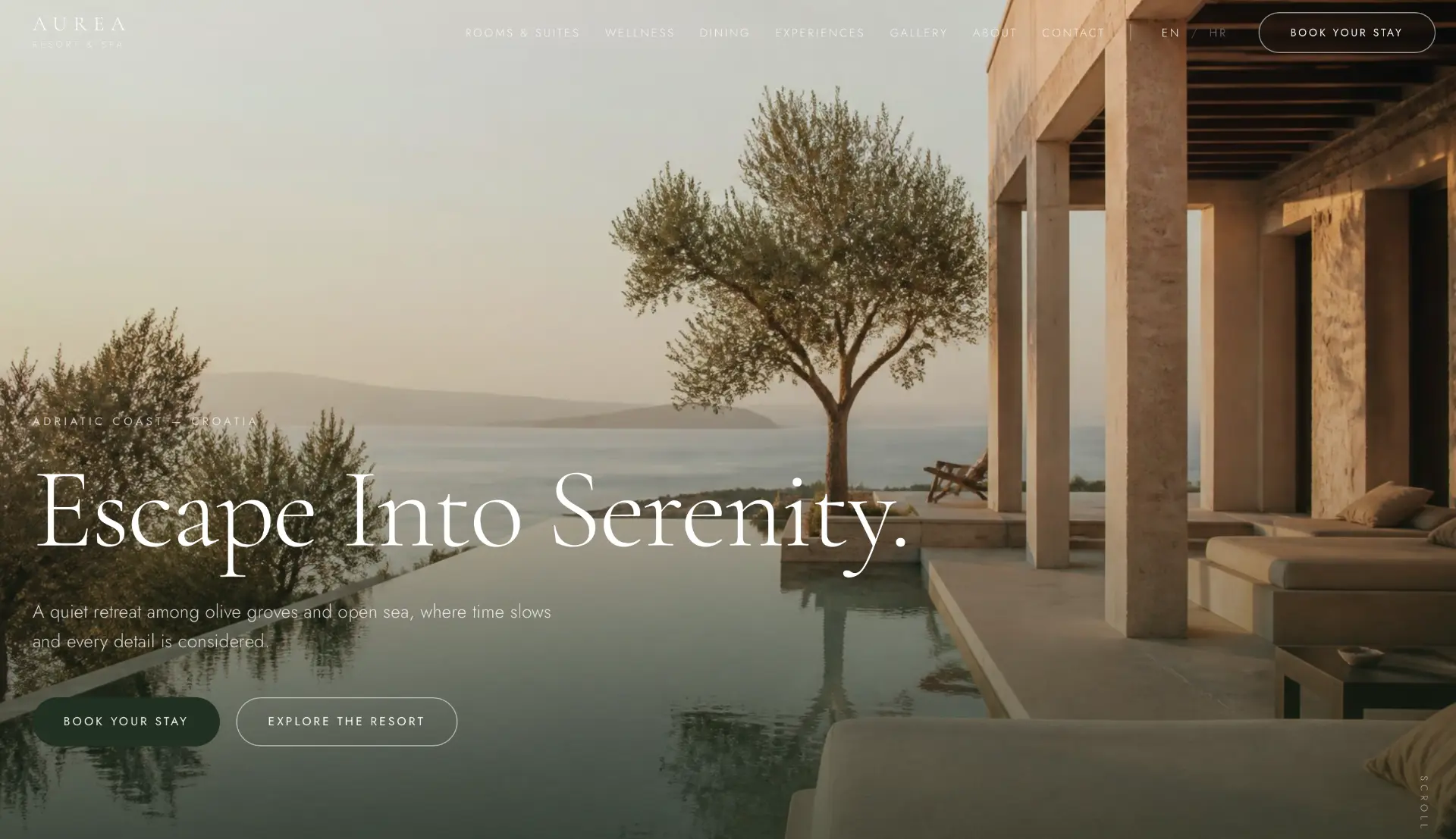
Project overview
Aurea is a resort & spa concept on the Adriatic coast, set among olive groves above the open sea. The site must slow the visitor down — at the same tempo the resort slows its guests. Every decision, from photography to scroll rhythm, serves a single feeling: time moves differently here.
- The first screen as the first view from the terrace — sea, olive tree, silence.
- Rooms and wellness presented through experience, not specifications.
- Stay booking discreet, but always present.
The challenge
Hotel websites usually overwhelm the visitor: offers, pop-ups, discount counters and aggressive booking modules. That approach destroys exactly what a quiet resort is selling. The challenge was to build a booking flow that does not disturb the silence — and a site that looks like a destination, not an OTA listing.
Goals
Convey the feeling of calm within the first five seconds, without a single word.
Rooms, wellness and dining clearly separated, but in the same tone.
A booking CTA present throughout the experience, without aggression.
An equal bilingual experience for international guests.
Discovery & strategy
Conversations with boutique resort guests show a consistent pattern: guests do not buy a room, they buy the feeling of slowed-down time. The strategy therefore eliminated everything that hurries — and kept only what calms and convinces.
Guests buy the feeling of slowed time — photography and rhythm carry ninety per cent of the message.
Trust grows through detail: real amenity names, clear pricing, concrete experiences.
International guests book in English but browse at their own pace — navigation must be calm.
WEBINITY Framework
Every WEBINITY Original is built through the same five-phase framework. The framework is constant; the execution is always unique.
Business, users, market and the real questions clients ask.
Strategy, message, information architecture and success metrics.
Typography, scale, photography, rhythm and the design system.
Clean execution, performance, accessibility and SEO foundations.
Launch, measurement, iteration and long-term support.
UX process
Journey mapping
We defined the steps of the user journey and the single question each step must resolve.
Information architecture
Content is ordered by the sequence of questions, not by the company's internal structure.
Wireframe
Structure was tested without photography so hierarchy holds up without emotional support.
Prototype
The mobile prototype was walked through a real scenario: evening, one hand, weak signal.
Design system
The system is deliberately small. Fewer variables mean a more consistent impression on every page and simpler maintenance.
High fidelity design
Wide photographic surfaces are interrupted by short, quiet passages of text. Transitions are slow and soft — the site deliberately does not hurry, just like the resort itself.
Behind the decisions
Information hierarchy
Experience comes before inventory: first the sea and the silence, only then rooms and rates.
Navigation
Seven calm items, from rooms to contact. No dropdowns, no banners.
Booking flow
The stay booking follows the visitor discreetly — present, but never pushy.
Photography
Natural light, warm tones, no filters. The photography must match the real experience.
Typography
An elegant serif for emotion, a readable sans for information. Never the other way around.
Spacing
Extremely generous spacing — space is quite literally part of the product here.
Accessibility
Contrast above AA, semantic headings and alt text that describes atmosphere, not just content.
Responsive behaviour
On mobile, photography takes the full width — the experience must not be compressed.
Premium perception
Silence as luxury: no pop-ups, no counters, no panic in the communication.
Final result
The result is a site that works like the first day of a holiday: it slows the visitor down and builds trust through calm. The booking arrives as a natural decision, not as a response to pressure.
Lessons learned
When the product is calm, every aggressive element on the page works against the sale.
Scroll rhythm is as much a part of the brand as typography.
A booking flow does not need to be loud to be effective — it needs to be timely.