Case Study 02
Atelier 47
A restaurant you taste before you ever visit.
Fine Dining Restaurant Website
Visit Live Website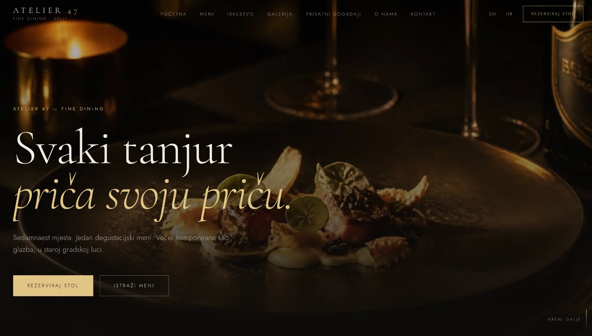
Project overview
Atelier 47 is a fine dining concept with seventeen seats and a single tasting menu, set in an old town harbour. The site does not sell dishes — it sells the evening. The task was to translate the intimacy of the room and the authorship of the kitchen into a digital form that reads like a menu, not a catalogue.
- An evening composed like music — and a site that follows that rhythm.
- Table reservation always within reach.
- A bilingual experience for local guests and international visitors.
The challenge
Fine dining websites usually fall into two extremes: a cold catalogue of dishes or an over-styled aesthetic without substance. Both lose what matters most — the reason someone would book this particular evening, in this particular room. The reservation flow is typically buried deep in navigation, exactly where the decision should already be made.
Goals
Convey the intimacy of a seventeen-seat room in the first screen.
Table reservation one tap away, from anywhere on the site.
Menus presented as a story, not a price list.
A bilingual experience (HR/EN) with no compromise in tone.
Discovery & strategy
We analysed how guests choose restaurants for special occasions: the decision is driven by atmosphere and trust in the chef, and only then by the menu. The strategy therefore leads with emotion and delivers information exactly when the guest is ready for it.
Guests book the occasion, not the meal — the site must sell the evening, not the plate.
A limited number of seats is not a weakness but proof of exclusivity. It is communicated openly.
International guests often book weeks ahead — the English version must be equal, not a translation.
WEBINITY Framework
Every WEBINITY Original is built through the same five-phase framework. The framework is constant; the execution is always unique.
Business, users, market and the real questions clients ask.
Strategy, message, information architecture and success metrics.
Typography, scale, photography, rhythm and the design system.
Clean execution, performance, accessibility and SEO foundations.
Launch, measurement, iteration and long-term support.
UX process
Journey mapping
We defined the steps of the user journey and the single question each step must resolve.
Information architecture
Content is ordered by the sequence of questions, not by the company's internal structure.
Wireframe
Structure was tested without photography so hierarchy holds up without emotional support.
Prototype
The mobile prototype was walked through a real scenario: evening, one hand, weak signal.
Design system
The system is deliberately small. Fewer variables mean a more consistent impression on every page and simpler maintenance.
High fidelity design
A dark canvas, warm candlelight and serif typography build the atmosphere of the room before the guest reads a single sentence. The food photography is shot as portraiture, not documentation.
Behind the decisions
Information hierarchy
Atmosphere and reservation come before the menu, because the guest buys the evening first and the dishes second.
Navigation
Seven items in a clear order: from experience to contact. No dropdowns.
Reservation flow
The booking button follows the visitor through the entire experience — discreet but always present.
Photography
Dark, warm photography that matches the real ambience of the room — no stock imagery.
Typography
Large serif headlines carry the authorship of the kitchen; sans carries the practical information.
Bilingual design
HR and EN versions designed in parallel, with text rhythm adjusted for each language.
Accessibility
Contrast above AA despite the dark palette, visible focus states and semantic structure.
Responsive behaviour
On mobile the reservation becomes the primary element, because most guests book from their phone.
Premium perception
Restraint as luxury: fewer elements, more space, slower transitions.
Final result
The result is a site that feels like an extension of the room: dark, warm and assured. The guest arrives prepared for the experience, and the reservation is the natural end of the story, not an interruption.
Lessons learned
In gastronomy, atmosphere sells before the menu — the content order must follow that.
Exclusivity is communicated through restraint, not through volume of content.
A reservation flow must be invisible until needed, and instant when it is.